
I mostly said that because it’s what I thought it was, but I guess I didn’t see it right. I attached an image that shows where there isn’t a ton of delineation between colors.
Hopefully my next try will clear what I mean. Your point was related to the current new implementation and was exactly also my point: who doesn’t need multicolour highlighting could just stick with the default colour - that’s fine! But in the upcoming solution the default colour has a different meaning. While in the current state “green” is the default colour, in the next implementation the default colour ist the colour of the old pre-multi-colour-highlight-state. That means (as you can see in your screenshot “light palettes” where four themes are shown) that the default is 2x green, 1x red and 1x blue.
That leads to the annoyance that the default colour changes from red to green or from green to blue whenever I change the light theme. To prevent that I always have to pick another colour (below the default one in the upcoming implementation). That takes away the convenience to use simply the markdown syntax “==” WITHOUT further picking.
I understand that. But on the other side the upcoming implementation would also mean that you prioritise a matter of taste over usability. With the new colours, the improved text colour and the colour palettes for colour blind people you have solved all accessibility related issues. On the other hand changing the default colour logic is related to the taste and habit of a minority of users (who just love the beauty of the old colour) and introduces an inconvenience to the majority. If it were up to me the old colours could be removed away totally like in current implementation because - as I said - the accessibility issues are going to be solved anyway.
I hope you understand now better what I mean. If not @xun could help out and try an explanation in other words
(Not the OP.) I would love to have this option available as a colorblind user — color consistency has always been a point of friction for me. “I know I highlighted something here, why can’t I see it?”
And by “default” I assume you mean literally the same color and not some variation of that color based on theme?
while I would prefer yellow as default colour due to habits from real books I actually do not care really about which colour is the default one as long as the default one is the same one in each theme.
The problem in the upcoming implementation is: that each default colour (see your screenshot) has a twin colour: in one theme green appears two times and in another theme red appears two times. Let’s say a totally new user would see that: he will be confused
This assertion inaccurately describes the functionality argument many of us have been making for restoring the theme-specific highlighter colors–an argument made clearly and forcefully by @Jake earlier in this thread.
Also: Would a default highlighter color would be “an inconvenience for the majority”? That can’t be determined without user testing. They might also consider it a convenience, or nothing at all.
I find it annoying that your speech assumes that only pragmatic reasons are valid. It seems like you only care about efficiency. Beauty is subjective, so aesthetic reasons should not be considered valid reasons. Your perspective reflects the typical discourse of modern economic rationality. However, people eat because they like the taste of some food, not only for nutrition. Bear is also about aesthetics. If you only prioritize functionality, why not just use Apple Notes, which has recently added multiple colors for highlights? As for minorities or majorities, I would like to know your sources.
FWIW i don’t understand his point either and think your proposal is excellent ![]()
To avoid an misunderstanding: I am not against the theme-specific highlighter colour. Actually I don‘t care what kind of green or red or yellow. I just do not want that
- a highlight colour changes its colour when switching to another theme. To prevent that I would have always to pick up a colour from the palette
- two colours of same hue appears two times, once as default colour and another time as a pickable colour from a palette with a slight difference to the default one
For a new user who don‘t know the history of bears development that would be totally confusing
If the devs refuse an option to separate the functionality, I see another solution: the original theme specific colour just replaces its counterpart in the palette
Actually I am considering myself as a socialist rather than a neoliberal efficiency beast. However, I could turn the tables and accuse you that you only consider beauty as valid argument. Indeed I believe as someone who loves beauty that it shouldn’t affect usability. I prioritize latter one. In so far you are correct: I want to enjoy the simplicity of a default colour that doesn‘t change from theme to theme. And I do not want to see two colours of the same hue after switching to another theme (that‘s another issue I didn‘t mention so far explicitly): f.e. in one theme I use the themespecific original green colour as default colour and additionally the reds colour from palette - after switching to another theme I see two times red with a minimal difference: the red from palette and the themespecific red. How can that not be a serious usability issue?
Actually you offered a good basis for a compromise: as a person who prioritises beauty over efficiency you certainly can be expected to get your beloved themespecific highlight colours for the price of losing them as default ones. Why not an entry in the palette list at the bottom under all other colours called „themespecific“?
To be honest, the most elegant, meaningful, consequent and efficient solution is to get rid of the themespecific colours once and for all. After a few weeks they will be forgotten, nobody will talk about them and for sure no one would miss anything in the future. Bear is in continuous development. The version 2 killed some beloved features: the bullet points in the gutter that indeed were really nice. But that is part of development
Maybe you should try to understand. That helps. In my former post I presented a weird effect of the implementation:
That leads to:
Take a careful look at following screenshot and think about the consequences in regard to usability

It breaks the following approach:
Actually the old themespecific colour cannot have any meaning in the environment of a multi colour highlighting system as it changes its colour from theme to theme.
I imagine that I have put forward legitimate arguments. You are welcome to counter them by responding to them. But please don’t ignore them.
Try to understand ![]()
Because then all my current highlights would be green, as, by the way, they are now. In addition, since you want multiple colors, you shouldn’t mind using the palette. I just need one color.
Sorry, but to be honest that is a selfish argument and it doesn‘t justify the mentioned usability issues for all other users
We concur on this point, but unfortunately, every solution we’ve considered entails its own set of drawbacks, and this was the lesser of two evils.
Themes are crucial, and we’ve undervalued their significance. We’re attempting to rectify this by reintroducing the themed highlighter. This change will ensure compatibility with the previous functionality, but it also offers the advantage of using color-coded highlights that retain their semantic meaning even when switching themes.
We’re still open to more feedback, but so far we haven’t seen any better solution than the last proposal.
I’d like to remind everyone that all discussions here are intended to improve Bear. There’s no room for personal attacks or animosity among us. Please adhere to these guidelines, or we’ll have to start moderating the discussions.
@Paczki I’ve just discovered that Sequoia introduced new preferences for color-blind users:
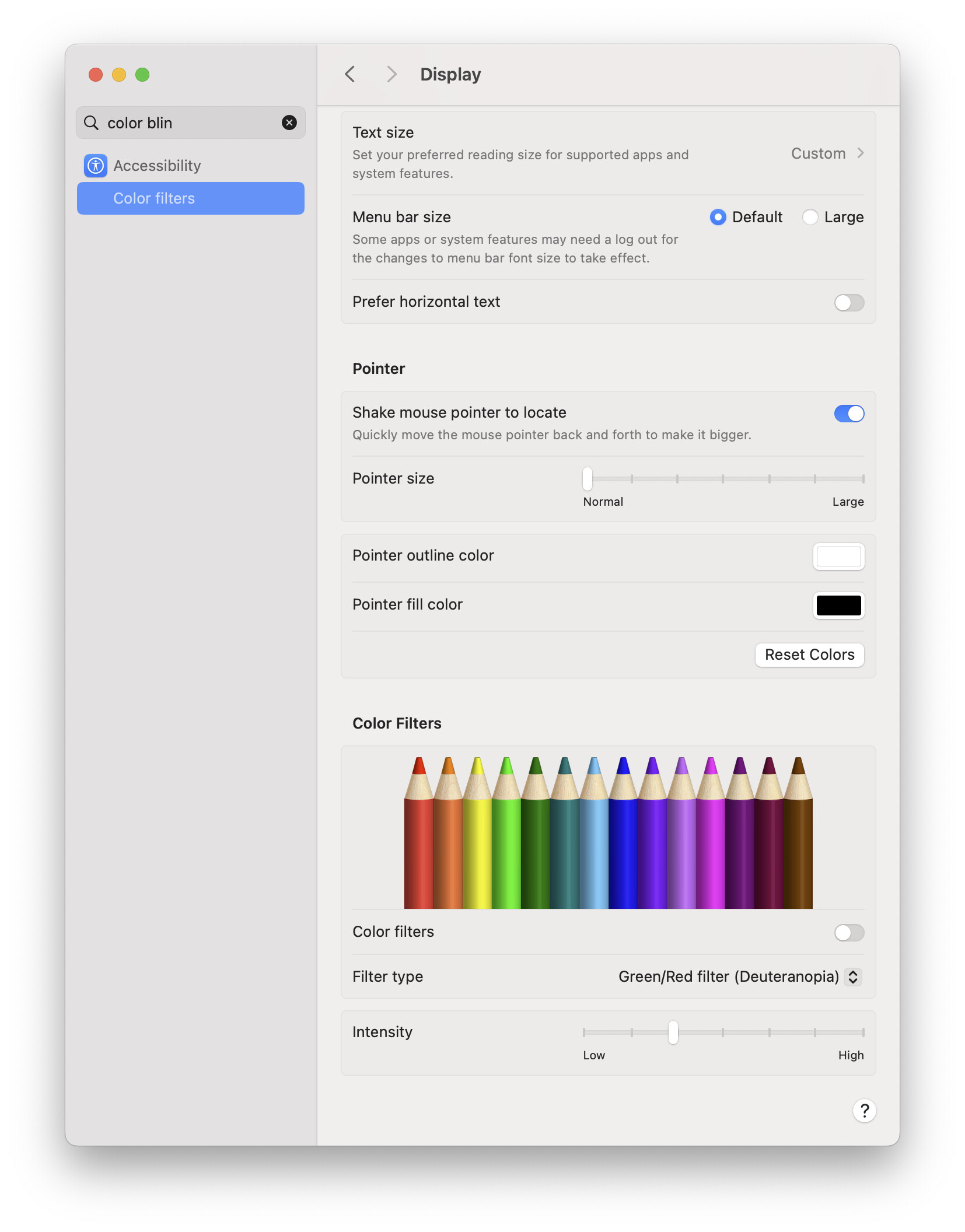
If you’re on Sequoia, could you try to enable this and evaluate the default colors of the highlighter?

Obviously, what I said applies to all other users interested in harmonizing theme and color. Everyone is seeing default highlights in green now, and not just me🙄
I suppose I understand the case you are making. From the perspective of mateo’s emphasis that the forum is for improving bear; I just don’t share your assessment of this as a problem and see matteo’s proposal as an improvement. Highlight color have always changed with themes, this doesn’t break the default behaviour. I also never change my theme, so don’t see that as a major issue. The experience of themes is highly familiar to anyone who uses an iphone (eg dark mode), so I don’t think it is particularly confusing.
The only “breaking” change is the one already introduced with this update: a breaking of a familiar theme appearance that I — and many other longterm users — previously adored. And a breaking of what happens to notes when updates: a new colour character in all highlights, even if i want the ability to have a “default” highlight colour without it.
So my advocacy is just that there are only a handful of users who use these forums, and I wanted to give voice to those who vibe with this solution to the issue. there was a lot of controversy when bear abandoned the editor’s inline markdown style, and this change is in that same category: there will be a lot of disagreement amongst users.
Insofar as trying to understand; broadly speaking, of course that is a valuable framework to pursue in life and in conflict resolution. And it is certainly a forum to treat respectfully, given that it has the ear of the developers of this app, and admittedly I was a bit rude about your argument. Beyond that, i don’t really perceive online disagreements as being a very good use of time to invest in as a general rule. Besides civil discourse, i just categorically don’t agree that either one of us has any inherent mandate to really invest any time in trying to understand the other’s assertions about the fringe issue of how our favorite notes app implements a new feature. The main motivation for posting here is to advocate for certain features and to communicate with the devs about how we feel about proposals. Interpreting other posts or convincing other users of my aesthetic preferences isn’t a major priority if I’m being honest.
@matteo This got me more interested in my colorblindness, and I took a couple of tests. It looks like I have moderate protanopia. I haven’t retested in a long time, and I think the tests are more accurate now.
So I started looking at the Prota palette. It’s better than Duete, and turning on that filter for Prota made things a little nicer for me. I dragged the slider up and down, and I think the best setting was at the first level notch of intensity past the Low, about 17.5% up.
Thank you for caring about this!
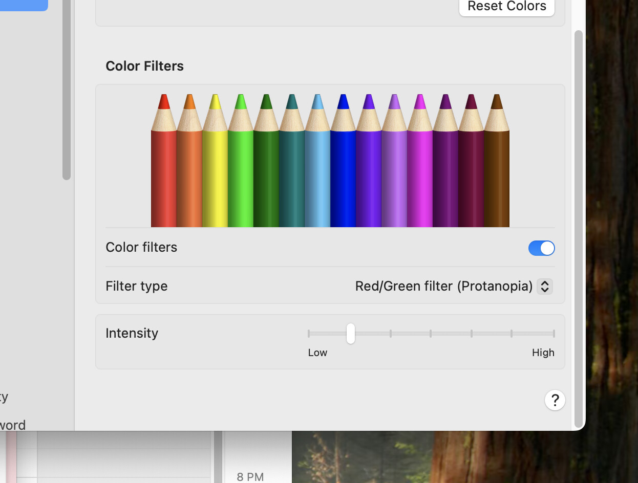
@matteo I also just want to mention that it helped me get the colors in the Bear Prota palette looking good. But adding that filter throughout the OS actually made some other apps worse, so hopefully, you can use this as a guide to adjust those default colors in Bear.
I am not against the theme-specific highlight colour per se. My problem is that it is the default one. Is there really no way to let the user choose the default one? This is precisely a problem that can be solved with the help of an offered option. I understand your general point against a bloat of options but I really don’t know where an option makes more sense. To say it in your words: You wouldn’t have decided against one evil but against both of them.
Judging by an older post, you seem having discussed about an option:
Actually I find my idea (that goes in another direction than rexicans setting to choose a default colour) to separate both functionalities not really bad: that would be a simple check option
I have to admit that it’s very easy to drive me up the wall. It’s all good! ![]()
Love, peace, unity and having fun! ![]()