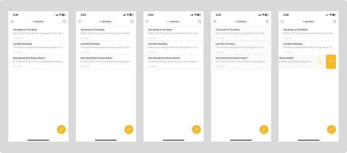
Screenshot 1 is from the current bear app on IOS and something about the first note not having a top separator is unsettling as not having a clear start and end—or a boundary—for an element always does.
in Image 2 I added a top line separator and I think it does help make the pane ‘feel right’.
in image 3 I tried extending the separators to the edge which did improve how fast I scan through titles but made the app look dated.
for image 4 I used cards which have helped solve all the above while also adding more consistency to the app as you can see in image 5 (default bear app) showing swipe actions which already use the card layout both for note and action.
You could easily extend this to the tags pane where you can group the default categories in one big card and the user created tags in other; something like the iMessage does.
PS
I’m not an UI/UX designer, so I might be missing something (apart from having 3 different activity states for a note—note when not selected, note selected and the open note. Also pardon the not great representation.

