I am absolutely loving bear for it’s simplicity, awesome UI and typography. It’s just a joy to use. I’ve noticed that when we change the text font or even the font size, the code font appears way larger than the text. I take a lot of coding related notes and this causes inconsistency.
Perhaps a reply from any dev? Cc: @rexikan . This issue is subtle but gets annoying when you have a lot of code blocks. I saw a couple of reports on this from 1 year ago but I think this is still an open bug.
The code appear slightly larger than text when you increase font size (and I have a large monitor so I have to increase font size to be able to read it).
@rexikan is this expected or are there any changes bear is planning (like a different setting to control code font size) ?
The current code font size is intentionally calculated to match the x-height and cap-height of the normal text font. This alignment ensures that both fonts sit on the same line and create a cohesive visual appearance:
The image above is from the most recent screenshot shared by @Atharva.
This design choice was deliberate, and we’re quite happy with the result. However, I’d love to clarify what you mean by “too large,” as it might point to something else we need to consider.
Hi @matteo, thanks for coming back. By “too large” I meant it when I increase font size in the settings, the code fonts appear a tiny tiny bit larger than the text. However, since this is deliberate I don’t mind using this implementation. I misunderstood it as a bug so reported it.
It looks slightly bigger to me even in the default size. I think it’s because the surrounding text is much more compact in comparison that the monospaced text looks bigger. The other day I was writing out a PR on Bitbucket and the monospaced text next to regular text looked great. I don’t know what they’re doing differently, but maybe you can give that a look.
You can see that the monospaced font in Atlassian’s editor is slightly shorter making it blend in with the surrounding text very nicely. Also the box surrounding the monospaced font has nice even padding on all opposite edges.
In Bear, the padding is bigger on the bottom for some reason and the monospaced text definitely looks bigger compared to the surrounding text no matter which mono font I choose.
I think there’s a term, something like “optical adjustment” or “optical alignment.” It’s a design principle acknowledging that mathematically perfect measurements don’t always look visually balanced, and designers might want to make subtle adjustments to create perceived balance. In UI design, this might involve adjusting padding, spacing, size, or alignment to compensate for visual weight, even if it means deviating from mathematically equal measurements.
The font family you chose has a different x-height then the default one. That’s why the letters appear larger. With the default option inline line-heights and x-heights do match.
This happens because there’s no independent font size option to go with the custom font family choice.
But regardless I still think the font size is too big on code blocks
Thanks for your comments @marlonjames and @mlw, when I look back at it again, indeed the code appears slightly larger (even in the default font and font size). This is not a problem when we have small code blocks but larger code blocks take a quite a bit of screen space and appears inconsistent with the surrounding text. The code blocks feel that they are screaming too my eyes, haha.
If you take a look at the article I shared, it’s not about matching x-heights. That’s the problem. Mono fonts typically have more visual weight than normal text at the same size. This is why scaling down mono fonts just slightly enough to match the visual weight of normal text should solve this.
Hi devs,
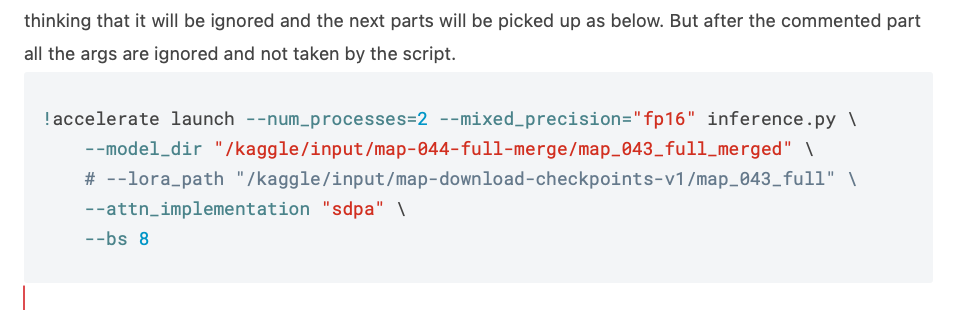
Do you intend to provide a seperate font size settings for code fonts (mono) ? will be helpful as I’ve a lot of code snippets in my notes and the code fonts really appear larger than the text font making the complete experience not so smooth. See the screenshot.