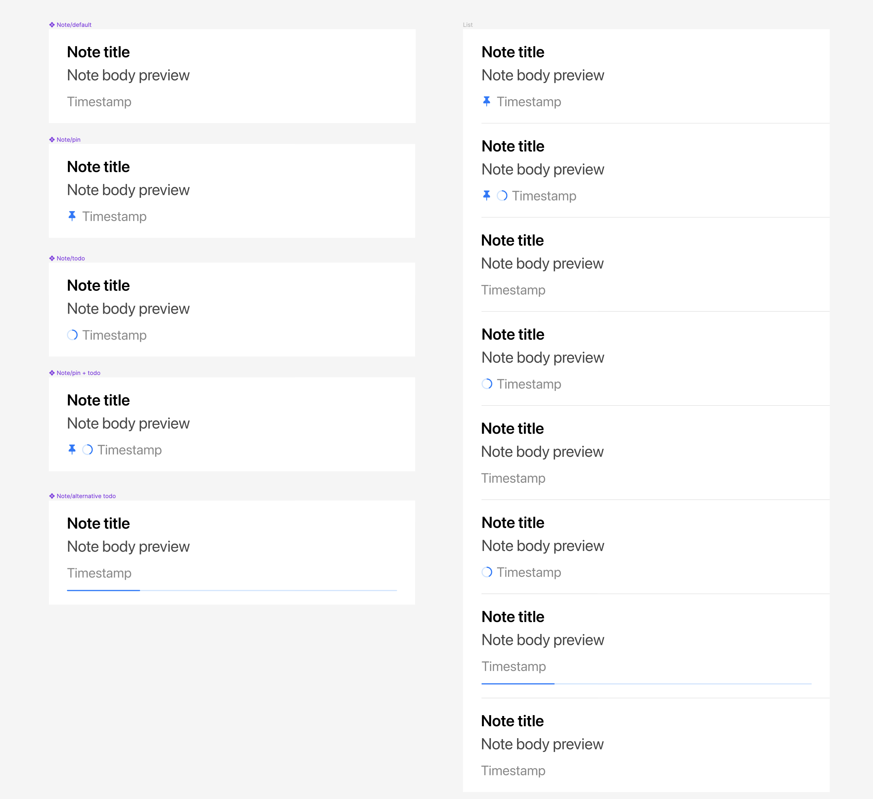
The hairline task completion indicator on notes in the note list that is placed immediately above the separator line is visually very distracting to me because it looks like a visual bug. I would love to see this feature pulled out from being paired to the separator line to reduce this quirkiness.
When i started using bear the first time, i even didn’t remark the indicator. I can understand that it can be a matter of taste to like another kind of indicator more than the other. But the current indicator is by far not distracting
The first time I remarked the indicator I thought it shows me how much I have read or where my cursor is placed. But I do not believe that any indicator shows it purpose clearly at the beginning as long as some text doesn’t give a hint. But an icon as indicator plus a text for explanation is hundred times more distracting than a simple line
I have had a similar experience with the thick line looking like a visual artifact. I don’t know which of the two options you suggested I like more, but in Things 3, I really like the circle. Granted I use Things for tasks and projects and Bear for packing lists for trips and such.