Fall is here, and Bear is ready to join the season of new goodies, from the iPhone 17 lineup to macOS Tahoe and iOS 26. With Apple’s new Liquid Glass design, Bear is also embracing the new fur-fashion with just a drop of liquid to match.
Bear’s interface has a fresh, refined look with more depth that makes everything feel more alive. The toolbar has been refreshed to match the new OS style, and the sidebar now blends naturally with Tahoe with a modern and softer look. It’s expressive and beautiful without losing Bear’s clean, minimal essence. Just open Bear, and you’ll feel right at home.
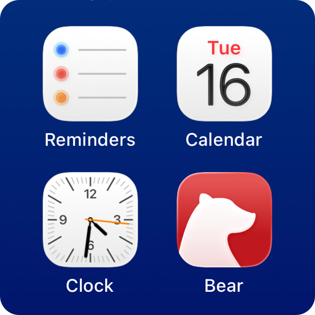
Our icons now carry a touch of Liquid Glass, with elegant gradients and subtle light. They fit beautifully with the new OS design, yet remain instantly familiar on your Home Screen. It’s the little details that make everything feel just right.
Update now and check out Bear’s new look with a touch of Liquid Glass magic. Comment below or reach out to us on Reddit, X (Twitter), Bluesky to tell us what you think!
Just one more of the many reasons I’ve moved everything over to Bear. On accounta you all being human and passionate about what you do and stufflikethatthere. Thank you, for so much more than this update. For everything you do, and the heart with which you do it. I feel the need to pawse and reflect. Over a bowl of fresh blackberries.
Thanks for the love! We are still polishing these icons. We want to bring the Liquid Glass feel while keeping the original iconic style. Hopefully we can share good news soon!
My favorite theme has a bug with the latest version. By the way, I hope the lighter part of the background of the side panel is part of the bug, because it got very ugly. I will use the dark version until this is resolved.