Version 2.7 is now available for macOS and iOS via TestFlight.
This release focuses on tags and TagCons. First launched in 2017, TagCons were designed to help you visually scan your Sidebar and quickly identify the tags you’re looking for. They’re also a simple, delightful way to give your notes a bit of character.
Over the past year, we’ve redesigned all 260 TagCons to perfectly match Bear Sans and the modern aesthetic of iOS and macOS. With version 2.7, TagCons now also appear directly inside the editor, giving your tags a beautiful, clear visual presence while you write.
A new option in General Preferences to choose whether tags are added at the top or bottom of a note
Please give it a try and let us know what you think.
Note: You may see some missing icons if you’re using a previous version of Bear alongside version 2.7.
With regards to the setting for the tag to be added at the top or bottom I do not see any difference. I tried the setting both ways and the result is the same.
Maybe I don’t understand what’s supposed to happen.
It’s an amazing update. Especially because of the option to finally place tags at the top of notes. I’ve tried every meaningful combination (with and without titles, with and without headings, with existing tags or not, with tags in the title, with text in the first line containing a tag) and everything works as expected.
When you drag and drop a note onto a tag in the sidebar, the added tag was previously appended to the end of the note. With the new option to add the tag at the top, this tag will now always appear at the top, specifically in the second line directly after the title.
The buttons in the tag editors window look too cramped because the outline has too little vertical padding. It’s not a big deal, but since Bear aims to be a pixel-perfect app, I think it’s worth pointing out.
Yesterday, I thought I had found a bug when placing tags at the top. Then I couldn’t reproduce it, so I thought I had been mistaken. But now I can reproduce it.
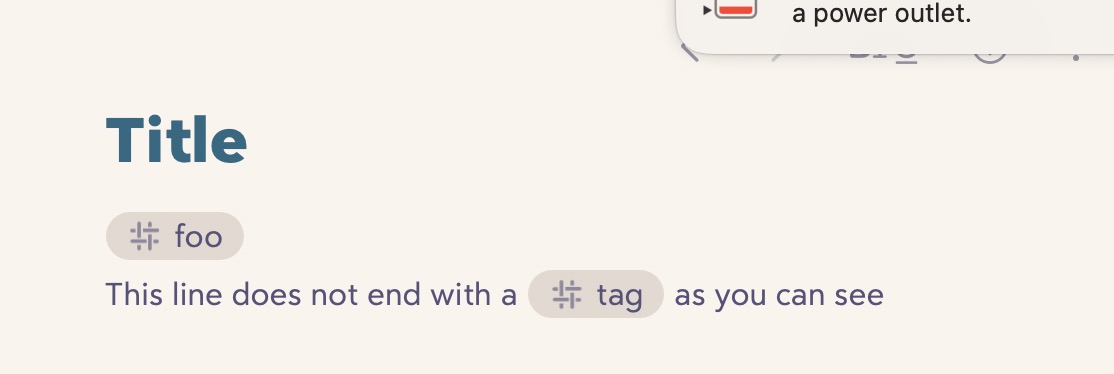
I wrote that everything works as expected when the existing text in the second line directly after the title contains a tag: the line is moved down so that the added tag fits in the second line after the title.
This only works if the text in the second line does NOT end with a tag. Here are screenshots.
Looking forward to this release! I’m hoping that there are new TagCons that are simple/minimal so I can visually clean up my sidebar. Most of my bigger tags have 8+ subtags, each with 3-4 subtags of their own. When I have a lot of tags unfolded, all the differently-indented “#” icons can look a bit ‘messy’ and tricky to navigate.
Also, I’m one of the PKM users that starts a tag with a colored square or emoji because I use the colors to quickly see the status (or a trait) of a subtag. For example “# In-progress#”, or “# Next#”. I guess now might be the best time to ask, do you think Bear would support colored TagCons? Maybe the in-line tag workflow could still be unchanged (defaults to the theme color like in Bear 2.6.7), but if a user wanted, it would be great to be able to select a color by right clicking the tag, then clicking through a small color picker? Or maybe like the highlighter color picker? Thinking through this because it would really help PKM workflows if we could color-code or make specific tags stand out.
Maybe if there were multiple variations of “status-indicator” TagCons? Maybe different shapes that follow a pattern (like an empty square filling up from 0/4, 1/4, 2/4, 3/4, to Full) or some metaphor to indicate progress/priority (ex: like a small “•” for low-priority, and for high-priority it could be a big circle “•” or maybe it goes from 1-3 like “•” “••” “•••”. Just sharing ideas because I would love for there to be a way to make the hierarchy feel easier to visually sift through without having to use workarounds. Thank you!
The idea is to add the tag to the “cluster” of tags if the first line begins or ends with a tag. The goal is to accommodate different ways to express the tags, such as